











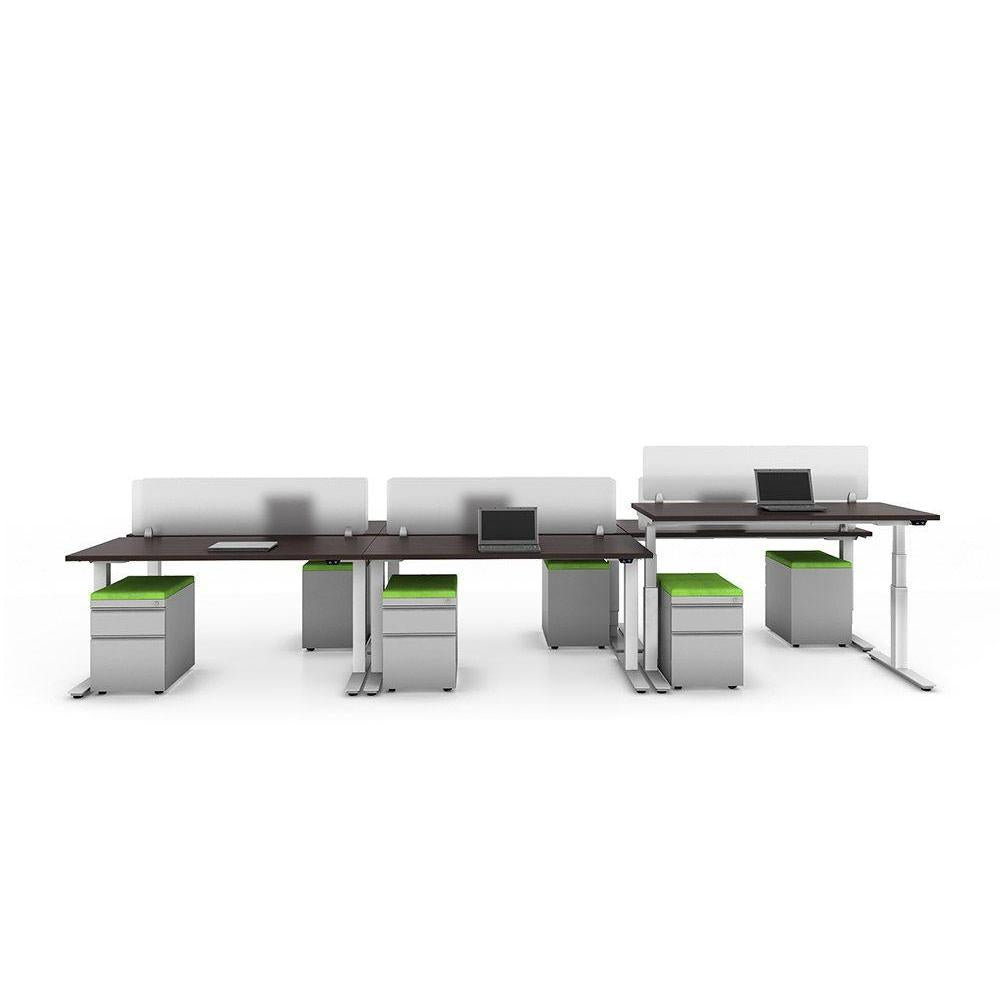


Office Furniture Color Psychology: How Finishes and Upholstery Shape the Workday
Most furniture decisions get made on specs: dimensions, weight ratings, lead times, price. Then somebody asks which finish you want, and suddenly you're choosing between eight laminate swatches and two dozen upholstery colors with no clear way to decide. It feels like the least important part of the order. In practice, color is the part of your furniture that everyone in the building notices every single day.
Office furniture color psychology isn't magic, and no shade of blue will fix a broken workflow. But research on workplace environments consistently shows that color influences perceived temperature, alertness, and how welcoming a room feels. Since the finish you pick will likely be in place for a decade or more, it's worth ten minutes of thought.
What Common Colors Actually Do in a Workspace
Rather than assigning a personality to every hue, it helps to think about what a space needs to accomplish.
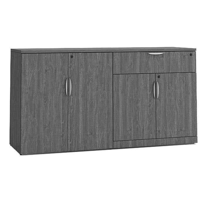
- Blues and cool grays read as calm and steady. They're a reliable choice for focus-heavy areas; accounting, engineering, call centers, anywhere people need to settle in for long stretches.
- Greens feel restful and are easy on the eyes over a full day. They pair naturally with wood tones and plants, which is why they show up so often in wellness rooms and break areas.
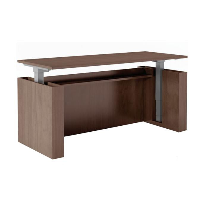
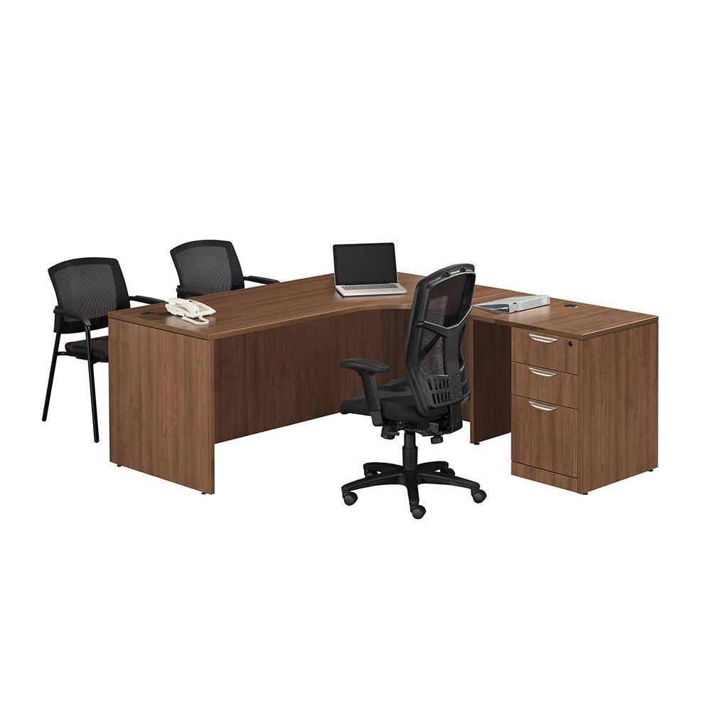
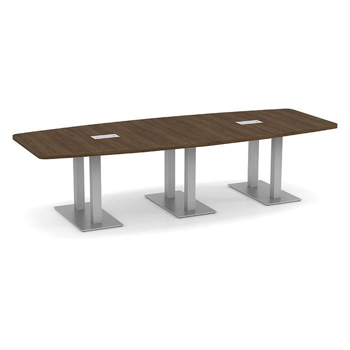
- Warm woods and neutrals like walnut, maple, and espresso signal stability and professionalism without feeling severe. They're the workhorse of private offices and conference rooms for a reason.
- Yellows and oranges raise energy and read as social. Used as accents on guest seating or lounge pieces, they wake a room up. Used across an entire floor, they wear people out.
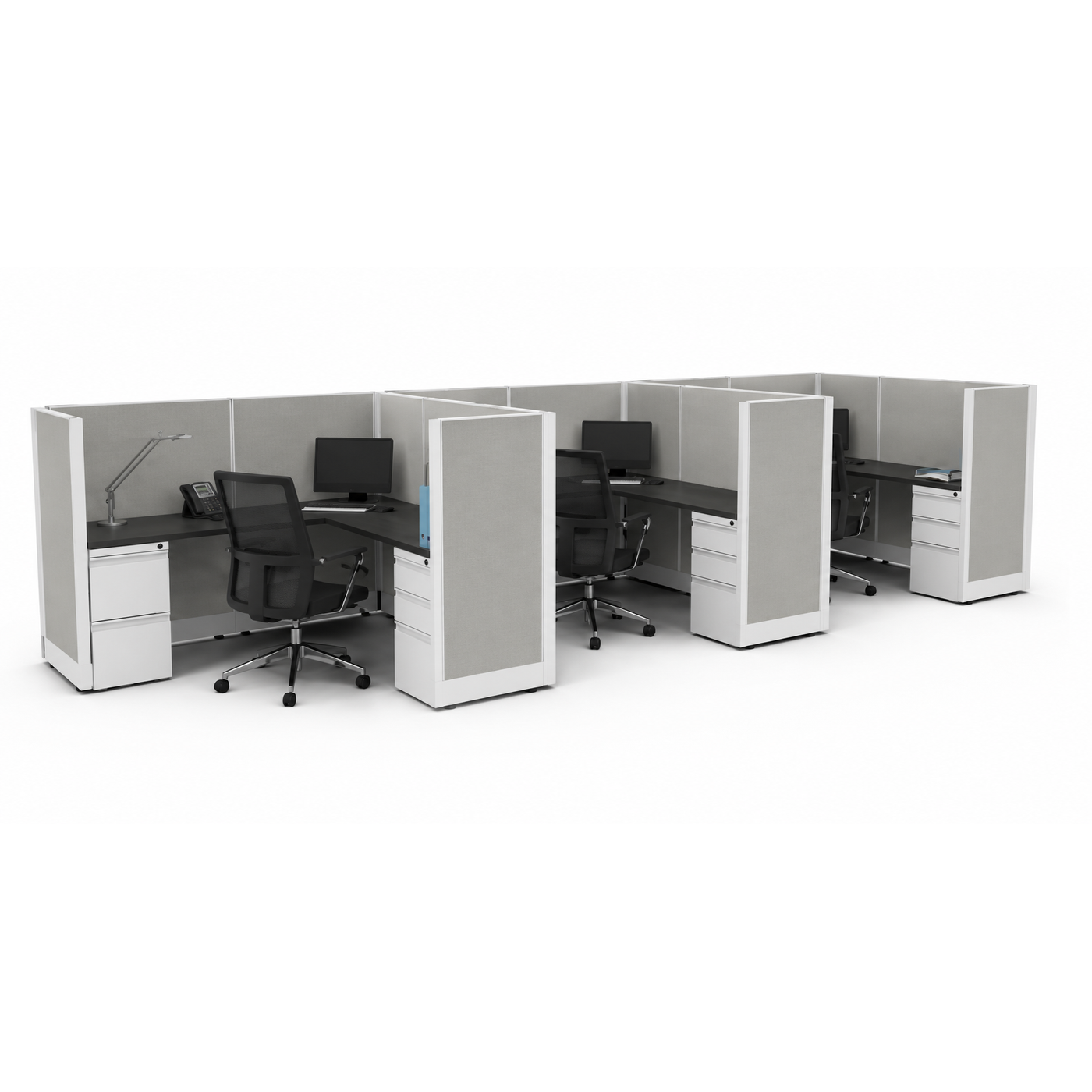
- White and light gray make small rooms feel larger and reflect light well, but an all-white office can feel clinical without warmer material somewhere in the mix.
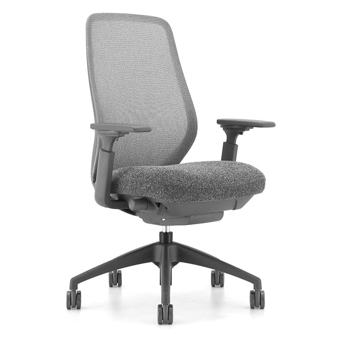
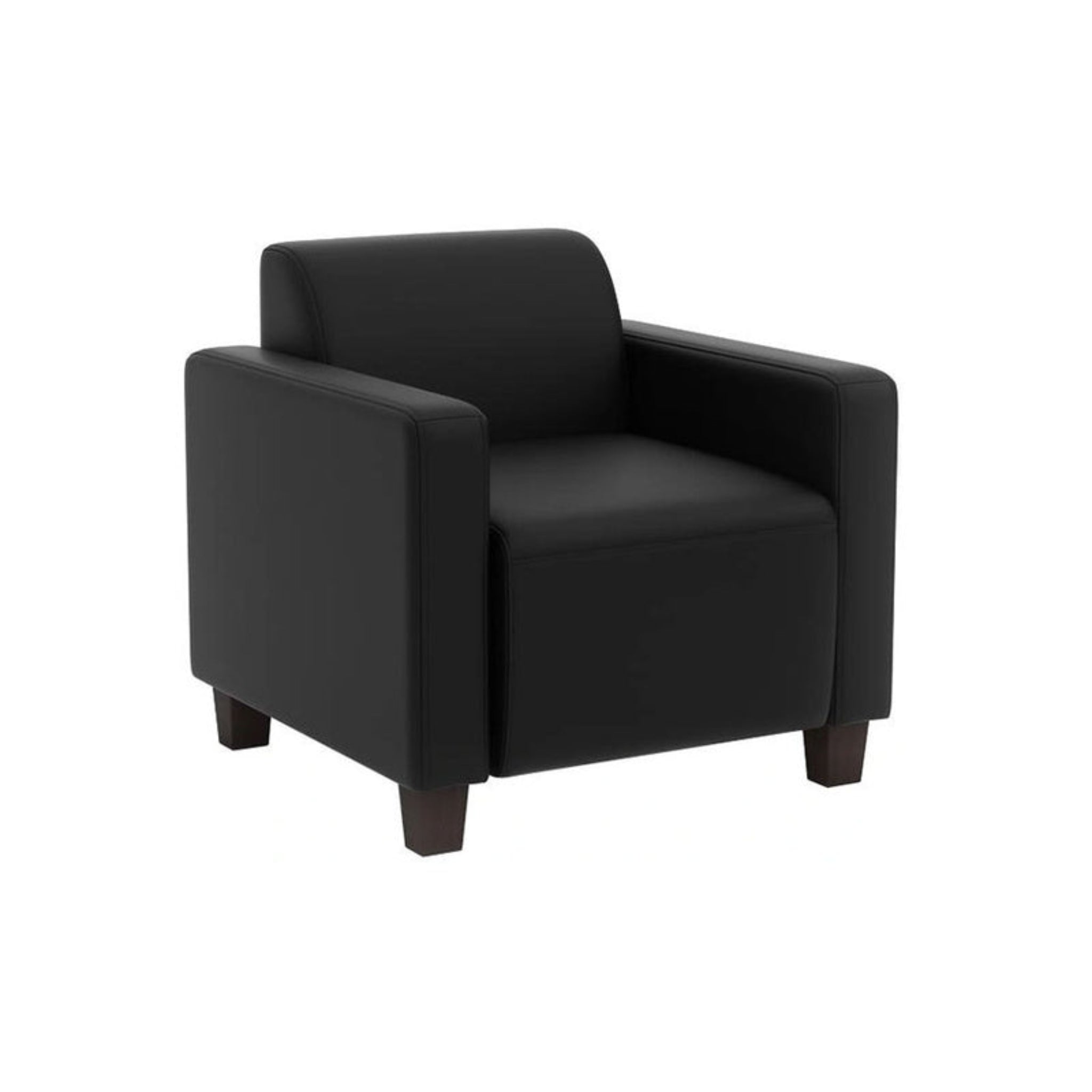
- Black and deep charcoal convey authority and hide wear better than almost anything else which is useful on task chairs in high-traffic spaces.
Match the Color to the Room, Not the Whole Building
The most common mistake is picking one palette and applying it everywhere. A reception area and a focus room have opposite jobs. Your lobby should feel warm and confident within a few seconds of someone walking in and that's where accent color earns its keep. A quiet room or private office benefits from the opposite: low-contrast, low-stimulation finishes that let people stop noticing the furniture entirely.
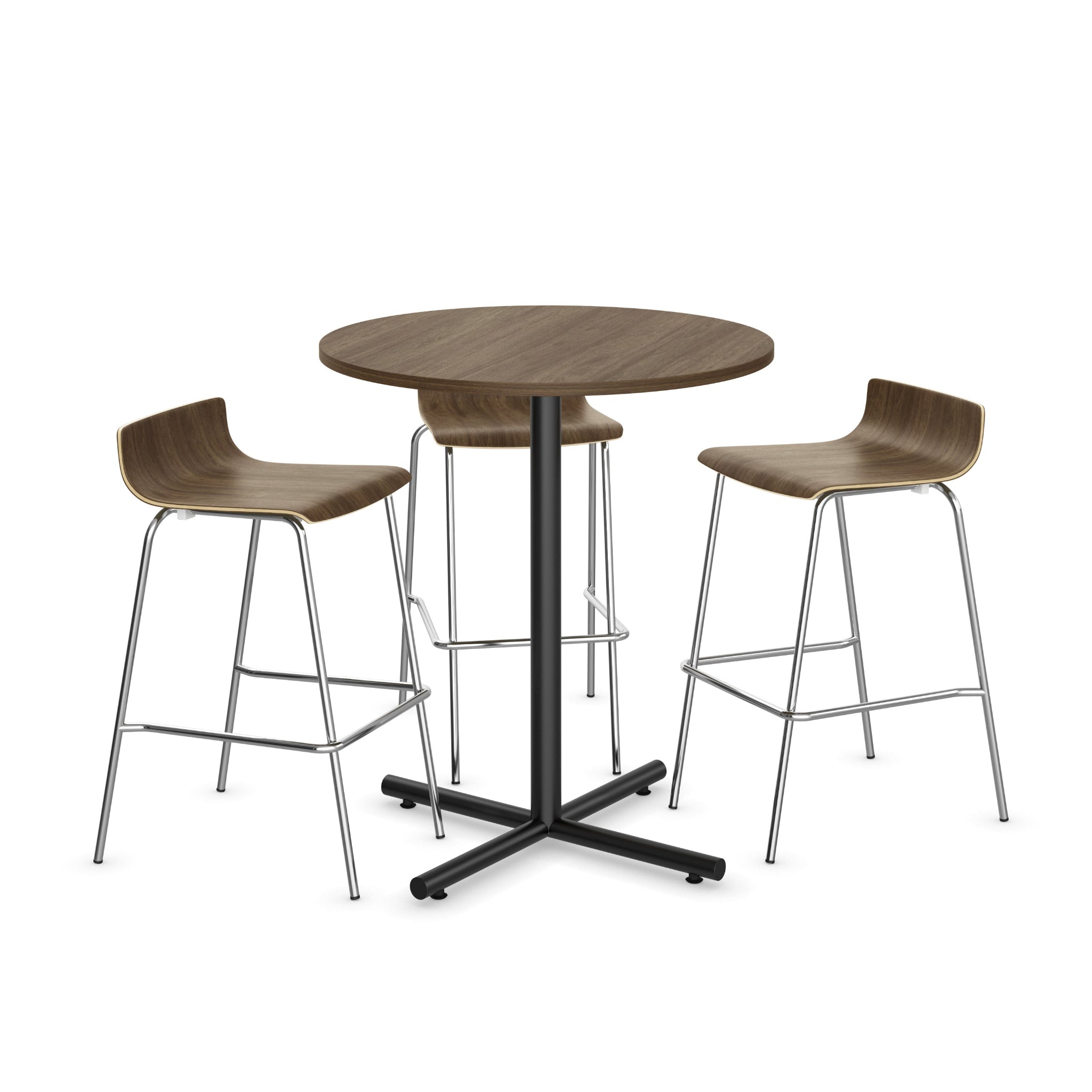
Training rooms and collaboration spaces sit in the middle. A neutral table surface keeps documents and screens readable, while brighter stacking or nesting chairs bring the energy. Break rooms can go bolder than anywhere else in the building.
The Practical Constraints Nobody Mentions
Color choices have maintenance consequences. Very light upholstery shows every coffee spill; very dark laminate shows every fingerprint and dust layer. Mid-tone finishes and patterned or flecked fabrics are the forgiving middle ground, which matters a great deal on shared seating.
Lighting changes everything, too. A gray that looks cool and modern under showroom LEDs can turn flat and blue under older fluorescent fixtures, and a warm walnut can go orange in a room with strong south-facing windows. If you're ordering in quantity, look at samples in the actual room, at the time of day people will be working there.
Finally, think about longevity. Trend colors date quickly. A common approach is to keep the expensive, long-lived pieces (desks, conference tables, storage) in neutral finishes, then put personality into the items that are easier and cheaper to swap later: guest chairs, ottomans, panel fabrics, accent seating.
Getting a Second Opinion Before You Commit
Finish selection is one of the easiest places to second-guess yourself, and one of the hardest to undo once a truck arrives. Our team looks at color combinations across full floor plans every week, and USDO's free office furniture space planning includes finish guidance alongside layout so you can see how your palette holds together before anything ships. If you'd rather judge in person, all eleven of our partner showrooms (Baltimore, Birmingham, Dallas, Denver, Kansas City, Minneapolis, Nashville, Ocala, Portland, Sacramento, and Seattle) let you see finishes and fabrics under real light. Every piece is new, commercial-grade furniture, with GREENGUARD-certified options available and nationwide shipping to all 50 states.
Ready to sort out your palette? Request free office furniture planning and we'll help you match finishes to the way each room actually gets used.
- Choosing a selection results in a full page refresh.